Are you trying to find the best color palette API? We have a recommendation for you!
One of the most effective branding strategies is color. It can be used to draw interest, convey meaning, arouse desire, increase conversion rates, and even win over a customer. When done properly, good color selections can influence how a visitor interprets what they see just as much as layout and copywriting.
Your website’s success online depends on the colors you choose for its design. They can easily help you win the attention of your target audience. You can use color to influence how your website visitors feel or react to a call to action. In contrast to black and white photographs, color images are easier for us to digest, which can improve brand identification and encourage website visitors to take action.
Color schemes greatly influence perception, so your palette needs to match your company’s intent.

How to choose the right color palette for your website:
These are the things you need to consider:
Branding: If your company is already established, start with colors that are consistent with your brand before introducing new colors.
Your Audience: The colors you choose must also reflect the feelings that your brand wants to evoke in its audience. Know the people in your target demographic and find out how they respond.
Trend: Being aware of color trends helps you anticipate future developments and build innovative, forward-thinking websites.
Emotional: Take into account the story you are telling as well as the kind of emotional reaction you want people to experience.
Balance: Consider the color harmonies; typically, you start with the dominant hue when choosing a color scheme. Then, begin layering your palette. Work your way back to lighter colors after darker hues since they are more likely to be noticed initially and have more visual impact.
Where to find color inspiration?
The outdoors, researching other design fields, understanding your clients and the competitive market, and keeping up with predicted trends in color and web/branding are all great places to go for inspiration.
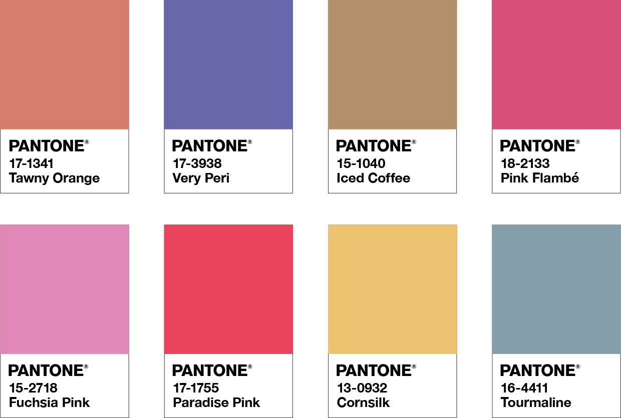
When it comes to color, Pantone is the leader in the design sector. The most recent color trends in graphic arts, fashion, interior design, paint, and plastics are provided by Pantone. A physical color index called Pantone is the ideal tool for any designer or company making printed goods. You can save time and effort by using physical color swatches to determine exactly how your hue will appear on paper or cloth.
If you want to get random Pantone Palettes to start working and get the inspiration you should try: Color Palette API.
How does the best Color Palette API work?
This API has the ability to suggest color palettes related to your current RGB colors. Also, you can get a random palette to start working with.

What this API receives and what your API provides (input/output)?
This API will receive the RGB colors that you currently have and will suggest additional colors to add to your current palette.
What are the most common uses cases of this API?
This API is ideal for those web designers that need to have different suggestions based on their current color palette. Be able to access a wide range of colors and start creating styled apps and websites with beautiful colors.

