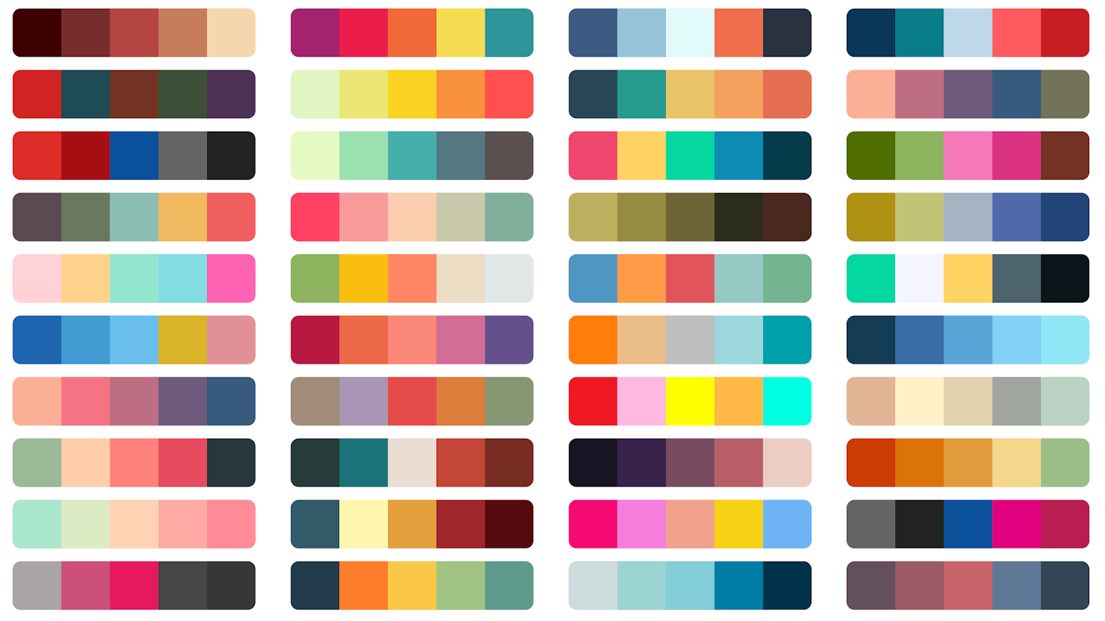
Are you trying to find a good API to get random color palettes? We have the perfect recommendation for you!
Have you ever noticed a color that instantly brought to mind a certain company? Perhaps you have experienced difficulty unwinding in a room with a conflicting color scheme or have had to return clothing you received as a gift because the color wasn’t quite right.
Colors have a big influence on our emotions, ideas, and mood. According to research by the Institute for Color Research, people subconsciously form an opinion about a thing within 90 seconds of first noticing it, and between 62% and 90% of that opinion is based only on color.
The difficult issue for user interface (UI) designers is to use color in their interface in a way that effectively communicates a brand’s visual identity.

UI designers rely on a framework called color theory, a complex collection of rules that informs the use of color in design, despite the fact that it may appear as though the color scheme of a website is a matter of the client’s personal preference.
Let’s start at the basics: what actually is color theory?
The use of color in art and design is governed by color theory, which also directs the selection of color palettes and makes it easier to effectively communicate a design message on an aesthetic and psychological level.
The color wheel invented by Isaac Newton in 1666 is a major inspiration for modern color theory. The primary, secondary, and tertiary color categories are represented by the basic color wheel. Well done if you can recall learning about these in art class; you’ve already mastered the fundamentals of color theory!
Color harmony refers to the utilization of color combinations that are aesthetically acceptable to the human eye and is arguably the most important part of color theory. Color schemes can either encourage consonance or contrast, but as long as they make sense when combined, they can still produce an appealing visual outcome.
All designers want to establish color harmony when it comes to UI design. The psychological urge for balance is the basis for color harmony, which draws the eye in and creates a sense of order. Lack of color harmony can cause an interface to be either under-stimulating (boring) or over-stimulating (chaotic and messy).
To bring your business to life you need a good color palette that represents your brand, to find the perfect one we recommend: Color Palette API.
Why do we recommend the Color Palette API?
This API has the ability to suggest color palettes related to your current RGB colors. Also, you can get a random palette to start working with.

What this API receives and what your API provides (input/output)?
This API will receive the RGB colors that you currently have and will suggest additional colors to add to your current palette.
What are the most common uses cases of this API?
This API is ideal for those web designers that need to have different suggestions based on their current color palette. Be able to access a wide range of colors and start creating styled apps and websites with beautiful colors.

