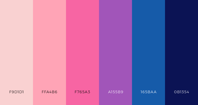
Do you want to find the perfect tool to find the ideal colors for your business? You’re in the right place!
One of a brand’s most important components is its color scheme. Understanding color’s impact and significance is essential to effective branding. Branding communicates meaning, but it only becomes a unified and powerful identity when accompanied by colors.
When picking colors for a logo or commercial product, there are numerous elements to take into account, such as the nature of the product. Are you marketing a service or a product here? Are the prospective customers young or old? Is your product a high-end item or merely a commodity?
Colors and brands naturally complement one another and cannot be separated. There are numerous examples, such as the iconic blue of Tiffany’s or the golden arches on the McDonald’s emblem. What hue is associated with the fight against cancer? It is pink, you’re right. Of course, there are countless other instances that could be given, but they are all connected by the fact that color produces a vibrant and detailed visual experience. In addition, colors enhance the beauty of each object, have a big impact on how we feel, and can subtly affect the choices we make when purchasing particular goods.

Colors dictate. How?
Colors control how we perceive the world. To establish a palette that will properly provoke a response in your intended audience, you must have a fundamental understanding of both web design and graphic design with regard to color perception.
When choosing a color scheme for your branding and logo, you should first think about your target audience and strive to make it appealing to them. The important thing to remember in this case is that the color scheme should be balanced while yet being eye-catching. It is not about your personal preference in color. A logical framework is necessary for logo design, and color harmony adds visual attractiveness.
How to engage viewers?
For branding to avoid becoming disorganized or monotonous, it must be harmonic. At the same time, it should draw in viewers and cultivate a sense of inner harmony. Keep in mind that a visual experience shouldn’t be so severe that viewers have no need to interact with it. On the other hand, viewers will leave if the visual experience seems excessive because they find it difficult to engage. The human brain just rejects anything it cannot comprehend visually, according to a straightforward idea.
Customers’ reactions and brand color have a notable relationship, therefore advertisers, business owners, and designers use the proper colors to ensure a successful enterprise.
Why do we recommend the Color Palette API?
This API has the ability to suggest color palettes related to your current RGB colors. Also, you can get a random palette to start working with.

What this API receives and what your API provides (input/output)?
This API will receive the RGB colors that you currently have and will suggest additional colors to add to your current palette.
What are the most common uses cases of this API?
This API is ideal for those web designers that need to have different suggestions based on their current color palette. Be able to access a wide range of colors and start creating styled apps and websites with beautiful colors.

