If you are looking for new ideas to design your newsletter and make it more attractive to your customers, then you should read this post!
It’s all about giving your readers a good time when it comes to newsletter design. The design has the ability to impact how we feel and make decisions. For example, you might want to close a busy email with hundreds of colors and go on to something else as you see it. Even if the email contains useful information. There is no shortage of information; it can be found anywhere. You will stand out from the crowd due to the simplicity with which you can consume that information.
In a world where there is so much information, getting your content, email, or newsletter recognized might be difficult. Designing an email newsletter is a way to make reaching out to your target audience easier. A visually appealing newsletter efficiently delivers the message while also being nice to the eye. When you give a discount or talk about your objective, you could think that aesthetics don’t important, but that isn’t the case. People are influenced by both your message and how it is delivered.
More importantly, email newsletter design is more than just a matter of aesthetics. It’s also how the content is organized for simple skimming, how the photos are laid out so they’re mobile-friendly, and how well the CTAs are placed to maximize conversions
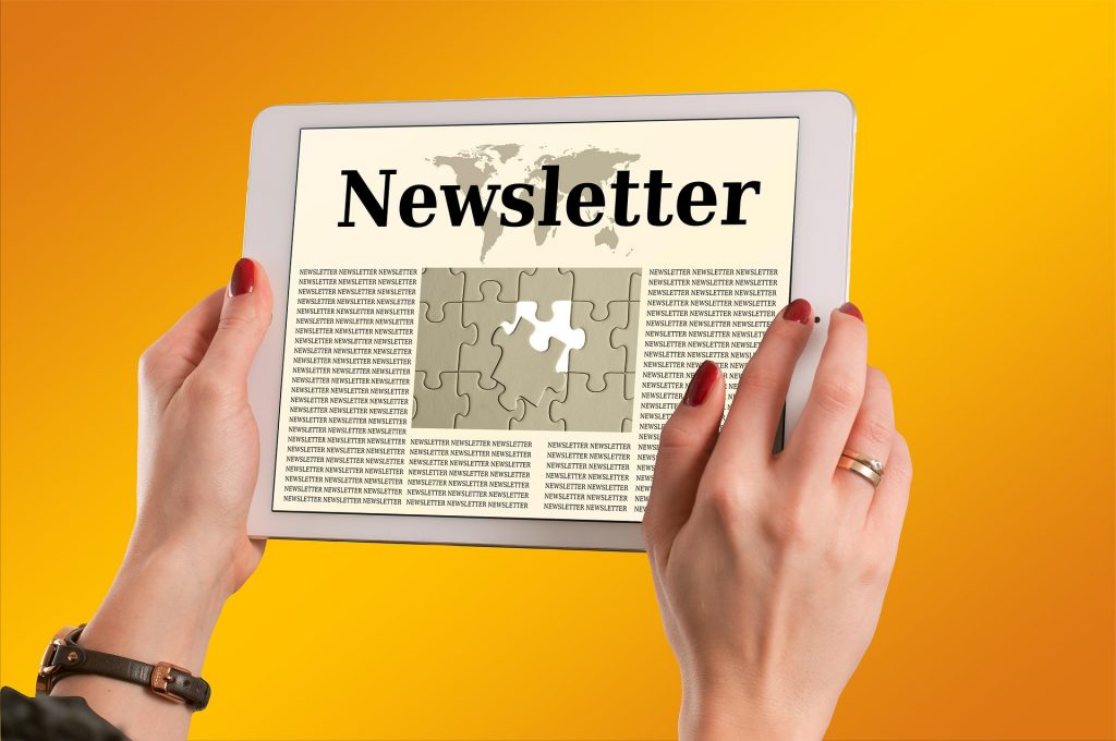
Our 5 Recommendations To Create A Good Newsletter Design
1. Maintain A Large Amount Of White Space
The empty space between distinct items in your email is known as white space, sometimes known as negative space. It aids in the analysis, examination, and division of data into easily digestible portions. People can focus on one piece of content at a time since email isn’t clumsy. White space surrounding CTAs can help them stand out and be easier to click if you’re employing them. After all, white space isn’t always a bad thing!
2. Experiment With Animations And GIFs
A picture is said to be worth a thousand words. As a collection of visuals, a GIF/animation must be worth a million words. A moving image is more likely to pique someone’s interest than a static image. This is not an opinion, but rather a psychological truth. Our forefathers had to survive in the wild, which improved their reaction time to movement. That is why humans are predisposed to move.
GIFs and animations in newsletters are a terrific method to get consumers to spend a bit more time reading your email, which could lead to them taking action.
3. Maintain A Consistent Design Language
The term “design language” refers to the entire visual appearance of a website, email newsletter, blog post, or even a product. It includes things like the font used, the color scheme, the types of photos that are allowed, how to highlight something, and so on.
For instance, we know that everything that is underlined and has a blue hue in Google is a link to something else. It does not alter when you open a new document. Similarly, you can establish such elements for your newsletter and ensure that anyone creating a newsletter at any time adheres to them. People will recognize your newsletter as a brand rather than a random email if you use a design language.
4. Make It Simple To Skim Over
Lay arrange the material in your newsletter such that it’s simple to scan through and consumers can easily locate what they’re looking for. The first line of a section of text or a heading should include a hook or a clear, concise argument that piques readers’ interest and makes them want to learn more. Ascertain that each segment makes a distinct and immediate point.
If your newsletter is jam-packed with text, images, and video (no matter how good the material is! ), readers are more likely to close it. This is, without a doubt, the most important of all the email newsletter design recommendations we’ve provided.
5. Have A Design That Is Interactive
Your newsletter should be engaging enough to make the reader feel involved. It should also make readers feel motivated to connect with the elements in your newsletter, as well as that the work they put in to simply click it will be well worth it.
A good CTA, for example, will entice the reader to act after reading your newsletter. It’s more likely to be overlooked if it’s a small text hidden within pages of content. But imagine if it’s a large, contrasting-color button at the bottom of the text with a compelling message! It would compel interested readers to click it.
6. Choose A Good Email Marketing Provider
If you want to start your campaign, Postr is the way to go. It’s an email marketing platform that lets you build email lists of current and potential customers or subscribers so you can send them newsletters and promotional content to boost sales. With this excellent tool, you can set up your campaign in minutes and provide perfectly relevant information to your clients.
Artificial intelligence is used in this platform to evaluate user activity and give hyper-relevant content to each individual. You may now personalize emails more easily than ever before thanks to a flexible template editor.
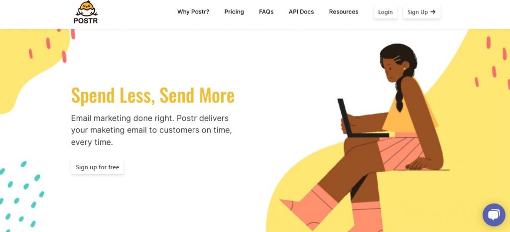
What Are the Postr Advantages?
- The drag-and-drop email builder is great for individuals who are new to the procedure.
- Using automation technologies, create workflows for follow-up emails.
- For example, segment users depending on their qualities, knowledge, age, and needs.
- To increase deliverability, you can also utilize algorithms to determine the optimal time to send the majority of emails.
Postr allows you to discuss issues that are prohibited on most other platforms. As long as the material is legal, your brand will supply pornography, dating, cannabis businesses, pharmaceuticals, casinos, gaming, and a variety of other topics. On a single list, the free plan offers at least 1,000 emails for 200 subscribers. These sums will eventually increase until you have unlimited alternatives if you upgrade to pro.
